Quarto Basics

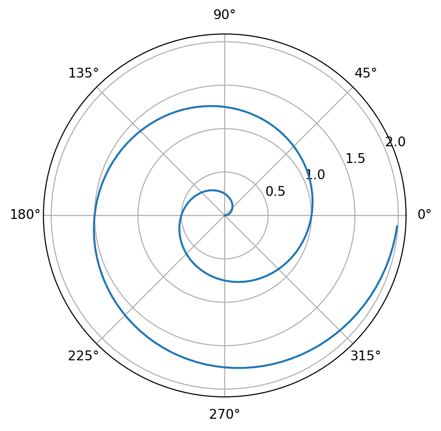
For a demonstration of a line plot on a polar axis, see Figure 1.

Code
import numpy as np
import matplotlib.pyplot as plt

r = np.arange(0, 2, 0.01)
theta = 2 * np.pi * r
fig, ax = plt.subplots(
    subplot_kw = {'projection': 'polar'} 
)
ax.plot(theta, r);
ax.set_rticks([0.5, 1, 1.5, 2]);
ax.grid(True);
plt.show()

Figure 1: A line plot on a polar axis

A plotly chart.

Code
import plotly.express as px
import plotly.io as pio
df = px.data.iris()
fig = px.scatter(
    df, 
    x          = "sepal_width",
    y          = "sepal_length",
    color      = "species",
    marginal_y = "violin",
    marginal_x = "box",
    trendline  = "ols",
    template   = "simple_white"
)

fig.show()

A plotly 3D chart.

Code
import plotly.graph_objects as go

import pandas as pd

# Read data from a csv
z_data = pd.read_csv('https://raw.githubusercontent.com/plotly/datasets/master/api_docs/mt_bruno_elevation.csv')

fig = go.Figure(data=[go.Surface(z=z_data.values)])

fig.update_layout(title='Mt Bruno Elevation', autosize=False,
                  width=500, height=500,
                  margin=dict(l=65, r=50, b=65, t=90))

fig.show()